If you’ve read Vishesh’s post on what we are building at SkyServe, your curiosity might have piqued at the mention of ‘insights’. We said that an ‘insight’ is all you need, and that the actual image is only for the ultra-rich wanting to put their acquisition under the hammer at Sotheby’s or Christie’s next auction. Why buy the orchard if all you need is just a pint of apple juice?
To that end, we’ve just launched EarthSIGHTS — a platform to experiment with the language of ‘geospatial insights’. By the book, ‘geospatial Insight’ or its older form ‘geospatial Intelligence’ is information used to describe, assess, and visually depict physical features and geographically referenced activities on Earth. But till today, this information has traditionally been plotted on a map. Given an image, the insights you gain by zooming, panning and clicking on the image are subject to your eyesight, academic qualification, pattern-recognition skills and past experience in looking at pixels and inferring something meaningful.
With EarthSIGHTS, you can study — at no cost — and from your laptop, smartphone or smart TV (yes, that’s a thing) any region through the lenses of land-use, water availability, atmospheric pollution, population and more. You may be a concerned citizen looking to find the source of the thick industrial smoke that is preventing you from going for that prescribed morning jog, or a journalist looking to quantify the loss of green space to convey the crux of your story on [insert concrete jungle of choice].
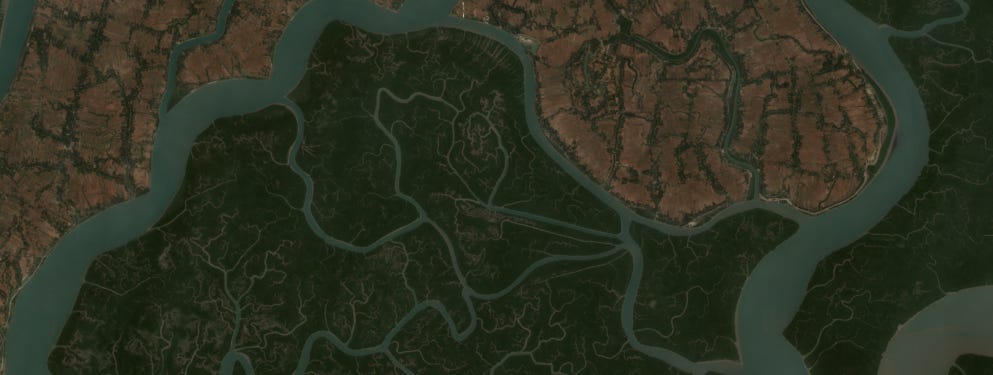
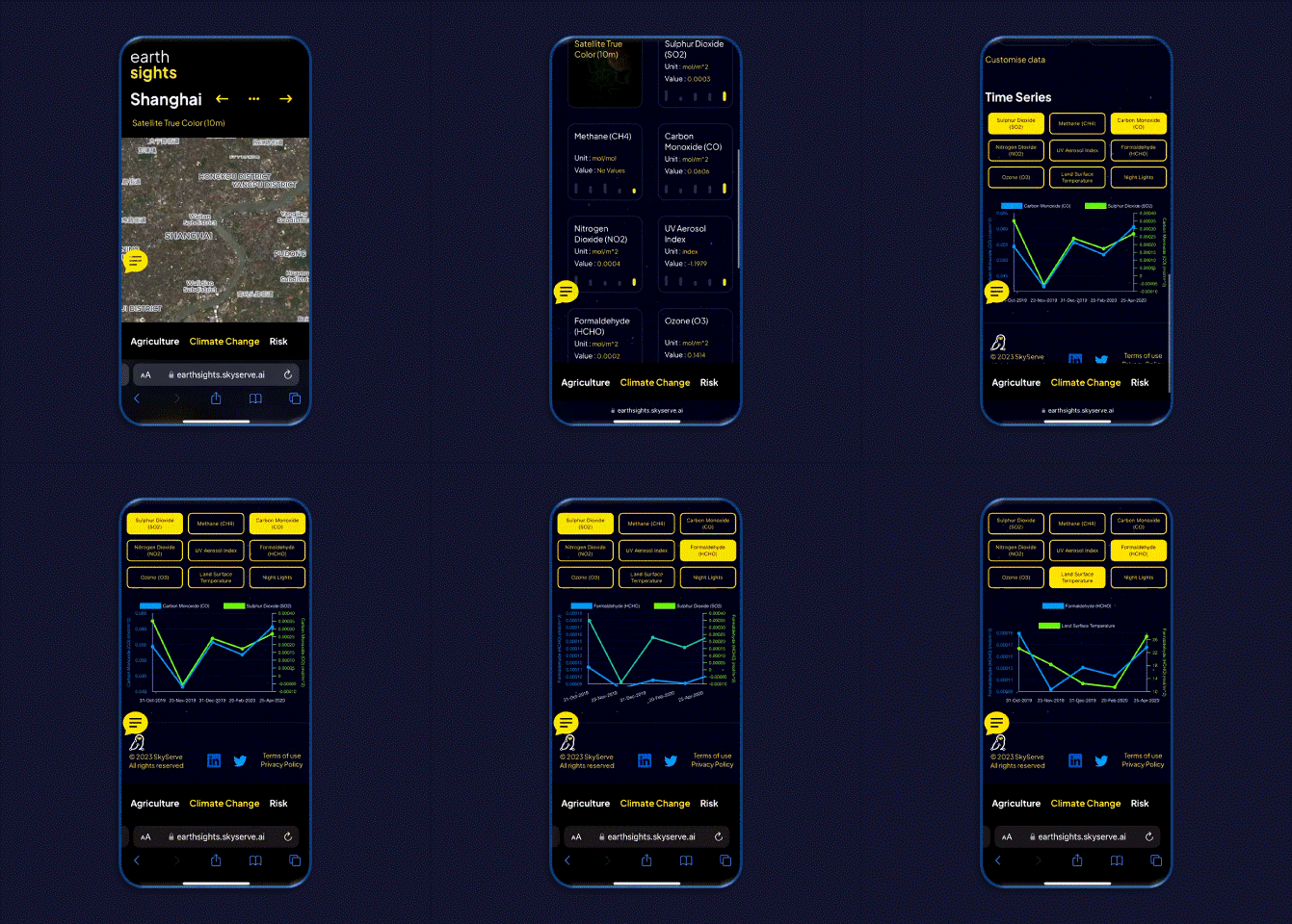
You can pick a location of interest, choose from a list of insights organized under ‘themes’ and view both spatial as well temporal data. We currently have 26 insight types, under the 3 predefined themes of Agriculture, Climate Change and Risk. We have also included true-color and false-color satellite imagery in case you need to take a step back and appreciate why an insight can speak directly to your brain’s parietal (do the math) and frontal (make the decision) lobes.
Get started
For EarthSIGHTS v1.0, we’ve curated a bunch of locations based on the recommendation of our team in Bengaluru and looked up news stories mentioning these places for which satellite data stitches together a gripping narrative in numbers. We have an area in Punjab on EarthSIGHTS, where stubble burning is apparent throughout the October–November 2021 period, which led to the annual smog-show above the Indian capital. Shanghai — the Chinese financial capital is also featured, around the time COVID-19 hit the world, where one can see the fall (and subsequent recovery) in atmospheric pollutants such as Nitrogen dioxide, Sulfur dioxide and Carbon monoxide.
The data powering EarthSIGHTS is derived from open sources such as the European Copernicus Program, the American NASA and NOAA satellites, the WorldPop research group and the World Resources Institute among others. The data processing has been done using Google’s Earth Engine API for Python, and then rendered for your eyes by our talented front-end team.
This is just v1.0, and we will keep the experiments going and seek your feedback throughout. Notice the little yellow speech bubble on the screen? Use that to let us know your views, issues and suggestions. We are continually improving the experience for users and have a ton of new features lined up for EarthSIGHTS v2.0. What else would you like to see on EarthSIGHTS?


